
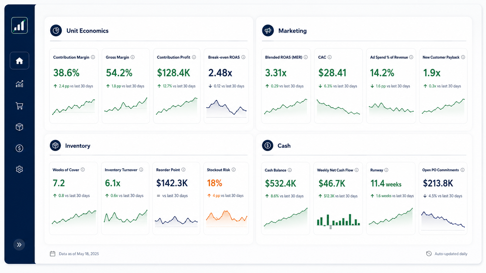
There are hundreds of ecommerce metrics and a handful that run the business. The rest are noise on a chart — nice to glance at, useless for a decision.
This guide sorts the KPIs worth tracking from the ones that only look busy, grouped by area, with a rough benchmark for each so you know what belongs on your dashboard and what a healthy number looks like.
Nothing here needs a data-science team; the numbers come from your store platform, your ad accounts, and your books.
The benchmarks below are directional and shift by category and model, so read them as a starting range rather than a target to hit. What stays constant is the shortlist: unit economics, marketing, inventory, and cash, plus a few whole-business numbers that tie them together.
Work through the areas in order and you’ll have a board that answers the questions that keep an operator up at night: am I making money per order, is acquisition paying off, is my cash safe.
What makes a KPI matter
A metric earns a place on your dashboard when it changes a decision. If a number moves and you’d reorder sooner, cut a channel, raise a price, or hold more cash, it’s a KPI worth watching. If it moves and you’d do nothing differently, it’s a vanity metric, and it belongs off the board so the ones that matter stand out.
A KPI earns its place if it changes a decision. If a number moves and you’d do nothing differently, it’s a vanity metric — leave it off the dashboard.
That test is why a focused set beats a wall of numbers. A dashboard with forty tiles gets ignored; a dashboard with a dozen you check on a rhythm gets used. The sections below cover the metrics that clear the bar, grouped so you can build the board one area at a time.
Most operators track too many metrics and act on too few, and the fix is to start from the decision and work back to the number that informs it, rather than starting from whatever data happens to be easy to pull.
Unit-economics KPIs
Unit economics tell you whether a single sale makes money before you scale it. The anchor here is contribution margin — what a sale leaves after its variable costs — because it sets the ceiling on what you can spend to acquire a customer.
Get these right and the rest of the dashboard has something solid to sit on.
| KPI | What it tells you | Rough benchmark |
| Contribution margin | What a sale leaves after variable costs | 30–50% of revenue (CM2) |
| Gross margin | Revenue after cost of goods | 60–70%+ for DTC |
| Average order value (AOV) | Average revenue per order | Category-specific; watch the trend |
| Customer acquisition cost (CAC) | Cost to win one customer | Below contribution per order |
| Contribution per order | Dollars left after variable costs, per order | Positive and covering CAC |
Read CAC and contribution per order together: the day it costs more to win an order than the order contributes, growth is burning cash. That single comparison catches more bad decisions than any top-line number.
AOV sits alongside as a lever rather than a headline: nudging it up with bundles or free-shipping thresholds spreads fixed shipping and fees across more revenue, which lifts contribution without winning a single extra customer.
Marketing and retention KPIs
Marketing KPIs tell you whether acquisition pays for itself, and retention KPIs tell you whether the customers you win come back. The number to hold every channel to is its break-even ROAS — the return where an order’s revenue covers its costs — with blended efficiency watched through MER.
| KPI | What it tells you | Rough benchmark |
| ROAS | Revenue per ad dollar, per campaign | Above your break-even ROAS |
| MER | Blended revenue ÷ total ad spend | Depends on margin; often 3x+ |
| Blended CAC | All-in cost to acquire, across channels | Well below customer LTV |
| Repeat purchase rate | Share of customers who buy again | 20–30%+ is healthy for DTC |
| LTV:CAC | Lifetime value against acquisition cost | ~3:1 as a rule of thumb |
Treat the 3:1 LTV:CAC rule as a starting point rather than gospel — a brand with fast payback can grow hard at a lower ratio, while a slow-payback brand may need more cushion. The truer read is how quickly a customer repays their acquisition cost.
Repeat purchase rate is the quiet compounder here — every point of retention lowers how hard acquisition has to work, since returning customers cost little to sell to again.
Inventory and cash KPIs
For a physical-product business, inventory and cash are the same story told two ways: stock is cash you’ve already spent. Inventory turnover tells you how hard that cash is working, and the cash metrics tell you how much runway you have before the next order is due.
Turnover and cash are worth reading as a pair, since a jump in one usually shows up in the other within a cycle or two.
| KPI | What it tells you | Rough benchmark |
| Inventory turnover | Times you sell through stock a year | Roughly 4–8x for many brands |
| Days inventory on hand | Days of stock you’re holding | 45–90 days is common |
| Sell-through rate | Share of received stock sold in a period | 70%+ over a season |
| Cash runway | How long your cash lasts at the current pace | Cover the next inventory cycle |
| Net working capital | Cash tied in stock and receivables, net of payables | Watch the trend as you grow |
Higher turnover frees cash and lowers the risk of dead stock, but pushed too far it tips into stockouts. The goal is turns high enough to keep cash moving while the service level on your key SKUs holds.
Days inventory on hand reads the same signal as time: rising days usually mean cash piling up as unsold stock, an early warning that a forecast or a buying decision has drifted.
The whole-business KPIs
A few top-line numbers tie the areas together and answer the blunt question of whether the business is healthy. EBITDA margin is the one to watch as you mature — it strips out financing and one-offs to show whether operations throw off cash — alongside the margins that build up to it.
Read the ladder from the top down and each margin explains the next: gross margin sets the ceiling, contribution margin takes out the rest of the variable costs, and EBITDA margin shows what survives the overhead.
| KPI | What it tells you | Rough benchmark |
| Revenue growth | Top-line trajectory, month over month | Context-specific; track the trend |
| Gross margin | Product-level profitability | 60–70%+ for DTC |
| Contribution margin | Profit after all variable costs | 30–50% of revenue |
| EBITDA margin | Operating profitability | 10–20%+ for maturing brands |
| Net margin | Bottom-line profit | 5–15%, varies widely |
Watch these as a ladder: revenue growth without margin behind it is a warning sign. A brand growing 40% a year at a negative EBITDA margin is buying revenue it can’t keep, and the whole-business row is where that shows up first.
Net margin is the final filter, folding in everything below the operating line: a strong contribution margin that collapses to a thin net margin points straight at overhead that has outgrown the business.
How to put them on one dashboard
The point of naming the metrics is to end up with one board you read on a schedule, rather than five reports you open when something feels wrong. The build is quick; the discipline is in holding it to the metrics that matter. To build it:
- Pick a focused set: Choose roughly 8 to 12 KPIs across the areas above, weighted to what you can act on this quarter.
- Set a review cadence: Watch cash and marketing weekly; review the rest monthly at close, when the books are final.
- Track trend over target: Put each KPI next to its prior period and its target, so you read direction and gap rather than a lone number.
- Cut what you don’t use: If a metric hasn’t changed a decision in a quarter, drop it and give the attention back to the ones that do.
The metrics to leave off
Naming what to drop matters as much as naming what to track, since a crowded board buries the signal it’s meant to surface. A handful of numbers show up on almost every dashboard and earn a place on almost none, because they move without telling you what to do.
Total followers and impressions lead the list — they measure reach rather than revenue, and a viral week that fails to convert changes nothing about how you run the store. Gross revenue with no cost set against it is the same trap in a nicer suit: a record sales month can sit on top of a shrinking margin, which is why contribution margin holds a tile and topline vanity doesn’t.
Website sessions, email list size, and app installs round out the usual suspects — real inputs, but too far from a decision to earn daily attention. The move is to track the metric one step closer to the money: conversion rate over raw sessions, repeat purchase rate over list size, contribution over gross revenue.
Frequently asked questions
How many KPIs should I track?
Aim for 8 to 12 — enough to cover unit economics, marketing, inventory, and cash without drowning the signal. A dashboard with forty metrics gets ignored, while a dozen you check every week get used. Start narrow, and add a metric only when a blind spot has cost you a decision. The right count also depends on your stage — a pre-launch brand needs fewer than a multi-channel operation, so scale the board to the decisions you face.
What's a vanity metric?
A vanity metric is a number that looks impressive and changes nothing you’d do — total followers, gross impressions, or lifetime revenue with no cost set against it. These can be interesting, yet they don’t point to an action, so they crowd the board without earning their space. The test is whether a move in the number would change a decision. Swap each vanity number for the decision-grade metric one step closer to the money, and the board gets shorter and more useful at once.
How often should I review the KPIs?
Review cash and marketing weekly and the full set monthly at close. Cash and ad efficiency move fast enough to need a weekly eye, while margins and inventory turns shift over months, so a monthly read keeps up. What matters most is the rhythm — a dashboard checked on a schedule beats one opened only when something already feels wrong. Put the review on the calendar the way you would a bank reconciliation, so it happens whether or not the month felt eventful.
What should I do if the forecast shows a shortfall?
Act on the weeks you can still change, which is the reason to forecast a full quarter out. A shortfall in week 9 gives you two months to close the gap: pull receipts forward by tightening wholesale terms or offering an early-pay discount, push payments back by renegotiating a supplier balance date, trim or delay discretionary spend, or line up credit before you need it. The forecast’s value is that these options are open while the shortfall is still weeks away.
Track the metrics that matter in one place
A shortlist of the right KPIs is worth little if the numbers live in five tabs you never reconcile. The KPI Dashboard brings your unit-economics, marketing, inventory, and cash metrics into one view and refreshes as you drop in the month’s data. Get the numbers in one place, and read the health of the business at a glance.
